Ordium
Brand identity for an upcycled malted-barley flour, making a circular ingredient feel useful, natural and ready for modern baking.
Services
- Brand Identity
- Art Direction
- Brand Guidelines
- Packaging Direction
Year2020
LocationColombia
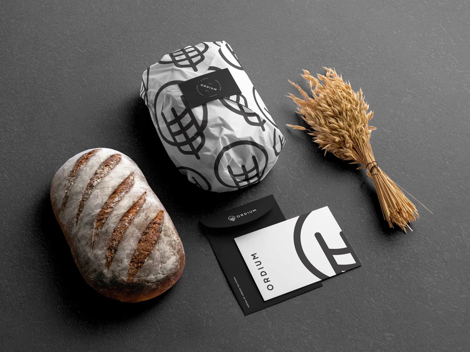
Giving a second life to malted barley
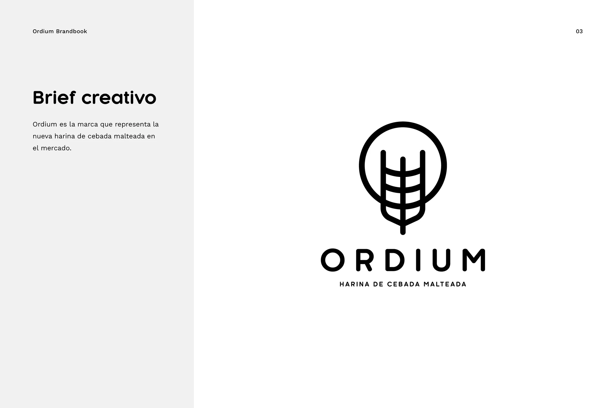
Ordium is a flour made from malted barley recovered for a new use. The identity needed to explain a less familiar ingredient while making it feel natural, credible and relevant to bakers.
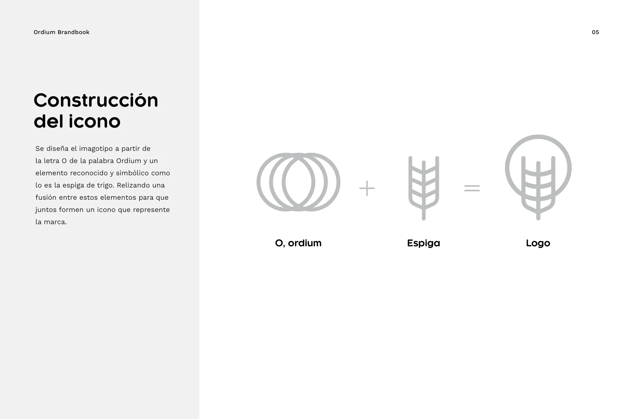
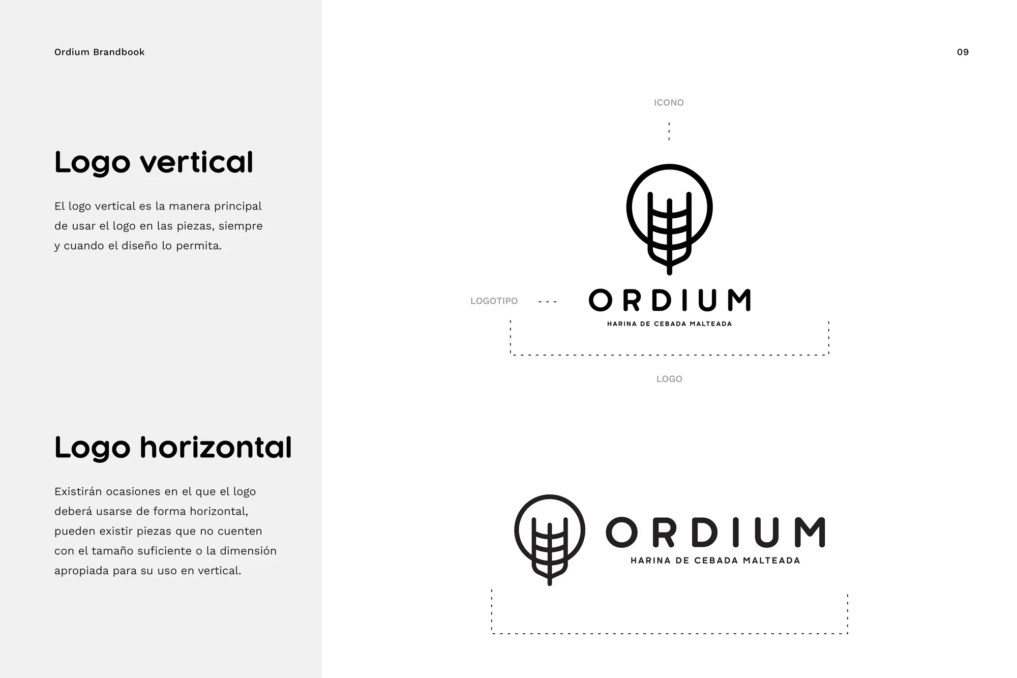
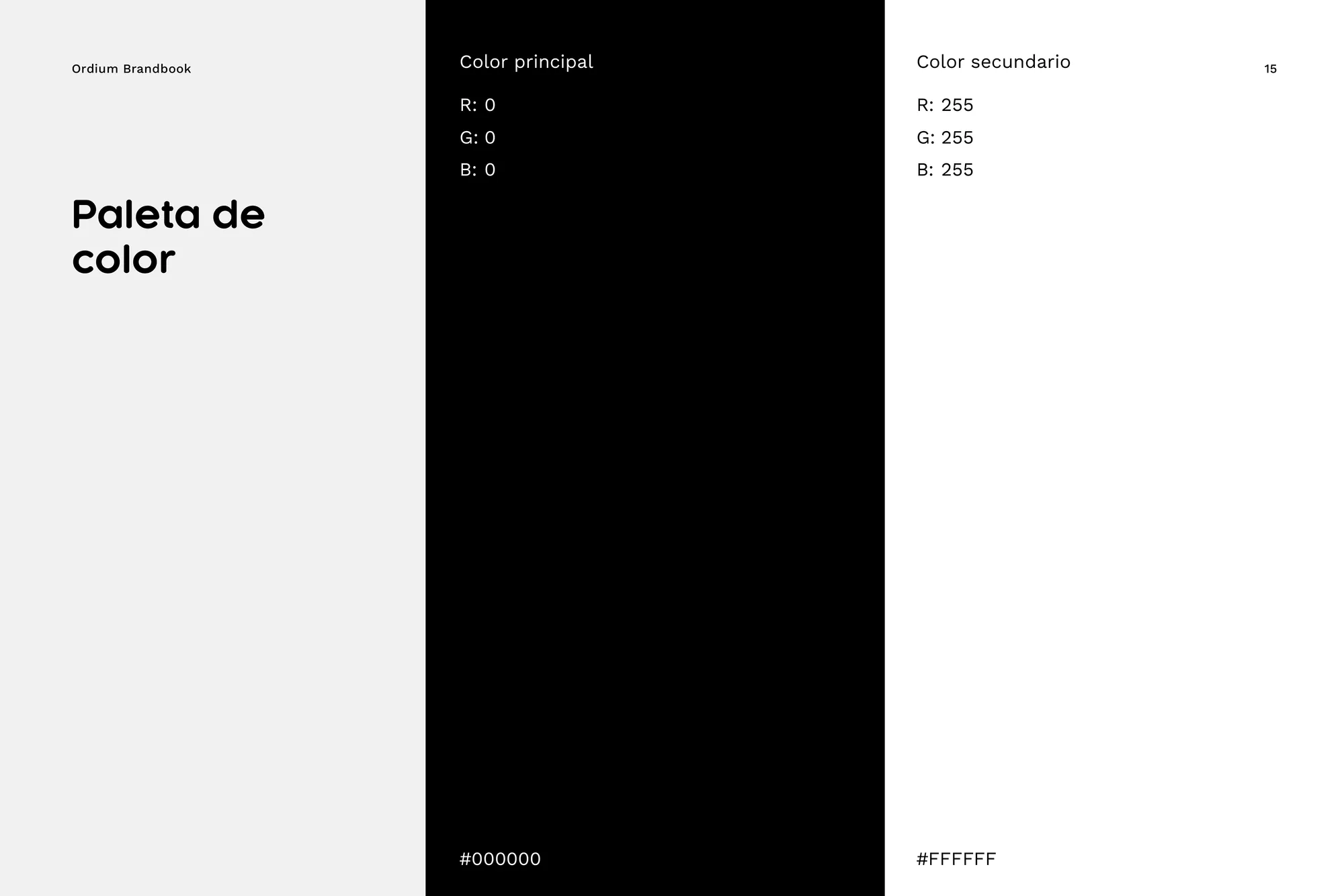
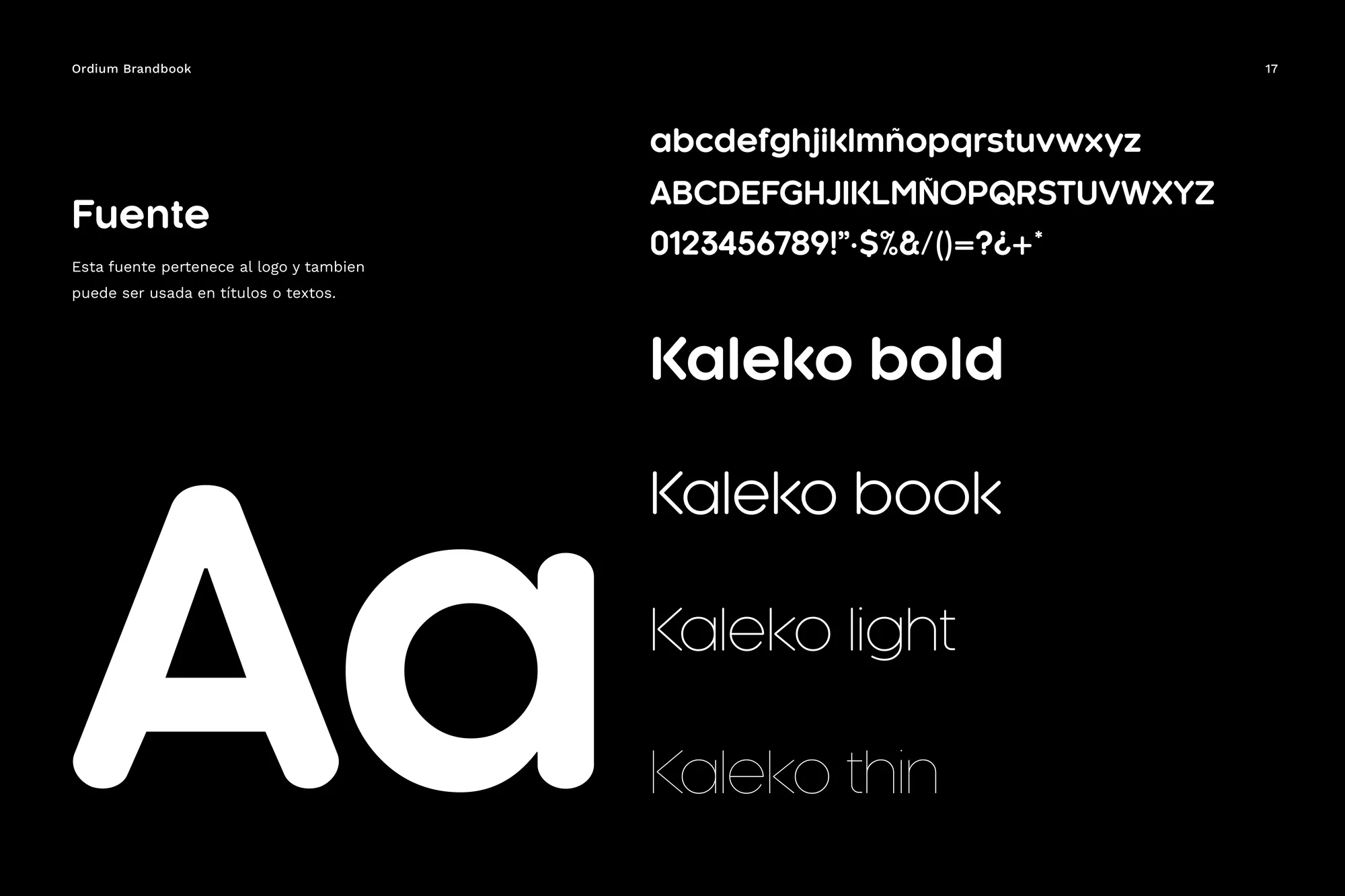
I built the mark by bringing together the O in Ordium and the form of a barley spike. The construction turns the product's circular story into a compact symbol, supported by an earthy palette and a straightforward typographic system.
The result is a brand foundation that helps an upcycled ingredient enter the baking category with clarity, connecting product innovation to the familiar craft of flour and bread.
Next projectRebrand / Industrial ServicesOperation Services Rebrand
Corporate rebrand for an industrial-services company, balancing technical capability, energy and a safer everyday identity.