Operation Services Rebrand
Corporate rebrand for an industrial-services company, balancing technical capability, energy and a safer everyday identity.
Services
- Brand Identity
- Art Direction
- Brand Guidelines
- Corporate Applications
Year2019
LocationColombia
A stronger identity for work in the field
Operation Services works in an industrial environment where capability, safety and trust need to be visible before a conversation begins. The rebrand had to modernise the company and create a more consistent system for teams, clients and suppliers.
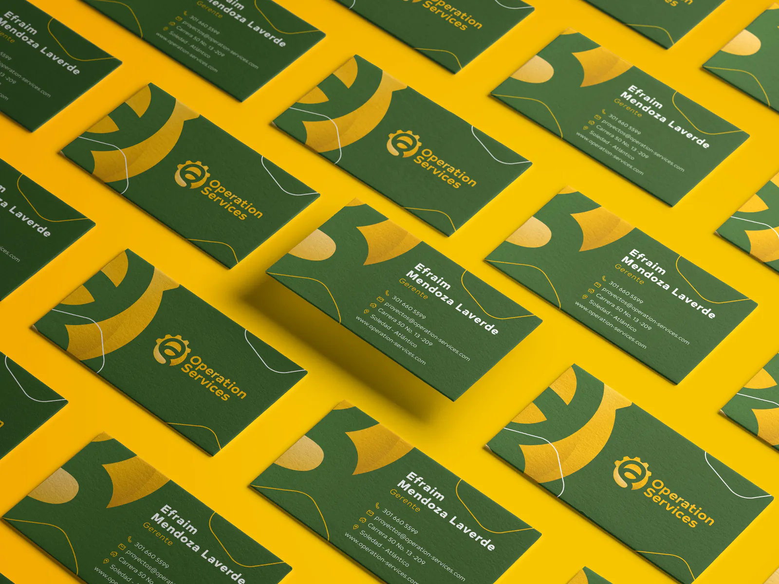
I developed the identity around a symbol that combines mechanical movement with the energy of the sun. Green and yellow bring the technical and human sides of the business together, while the broader visual language supports commercial documents, apparel and operational materials.
The result is a practical corporate identity built to remain clear in an office, on a uniform and in the field.



Next projectBrand Identity / BeautyODA Aesthetic
Brand identity for an aesthetic centre, combining clinical confidence with a calm, sophisticated sense of beauty and wellbeing.