R•A
WorkAboutFreelanceContact
Navigation
WorkAboutFreelanceContact
Social
InstagramLinkedInDribbbleBehance

© 2026 Ricardo Angulo.
All rights reserved.

RICARDO ANGULO
Visual Identity

Minuta Artisan Pasta

End-to-end visual identity for an artisan pasta studio — built around the craft, the tool, and the ritual of making from scratch.

Services
  • Brand Identity Design
  • Logo Design
  • Packaging Design
  • Menu Design
  • Business Card Design
  • Social Media Assets
Year2020
Role

Brand Identity Design / Logo Design

Scope

Brand Identity Design, Logo Design, Packaging Design

Minuta Artisan Pasta
Project Impact

Challenge

Minuta Artisan Pasta needed a clearer visual identity direction that could turn the project idea into a more coherent and usable visual presence.

Direction

The work focused on brand identity design, logo design, packaging design, building a visual language that could stay consistent across the main touchpoints.

Outcome

The result gives Minuta Artisan Pasta a more defined creative direction and a stronger foundation for communication, rollout and future visual decisions.

Built from the machine outward

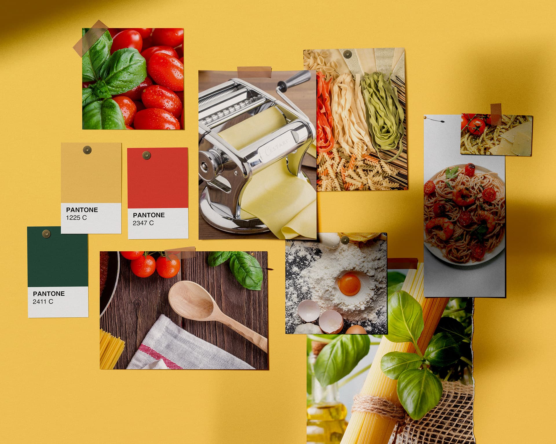
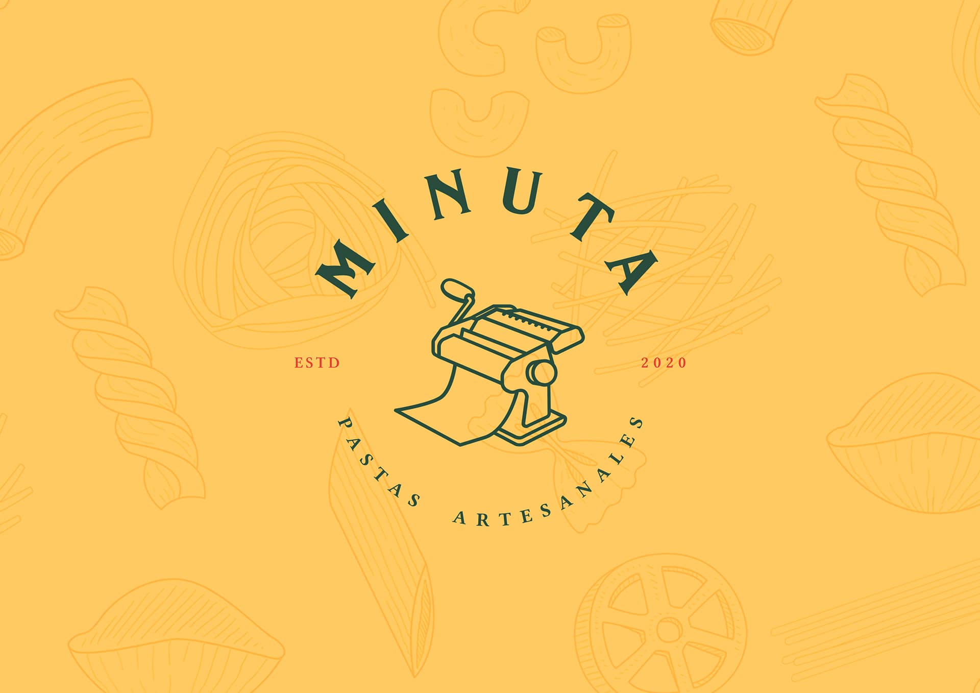
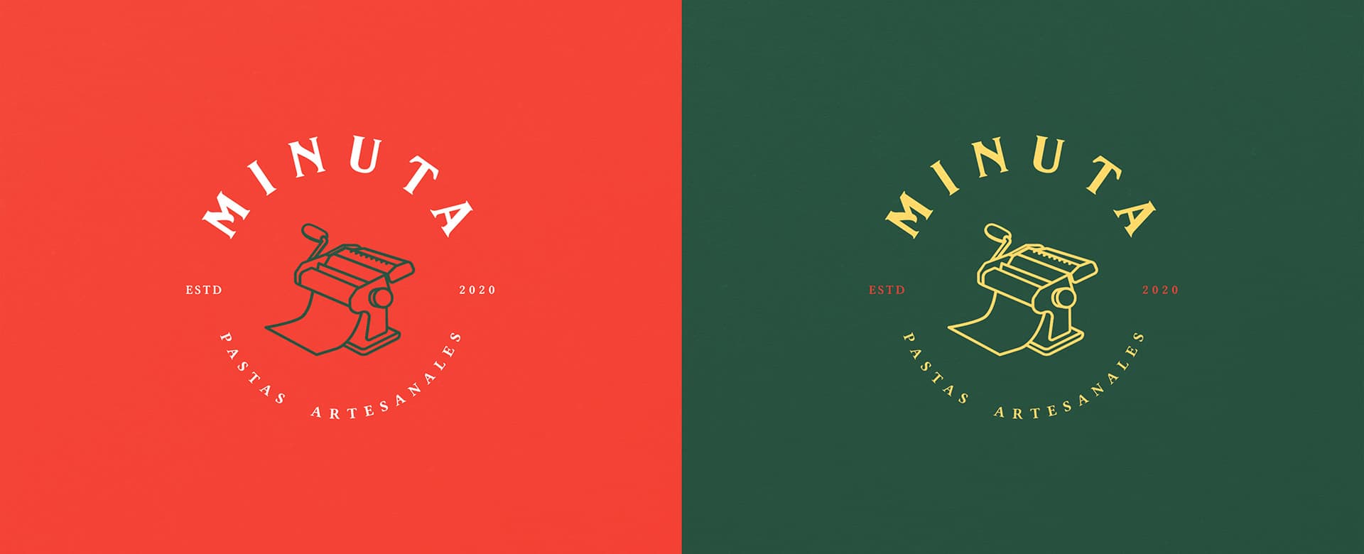
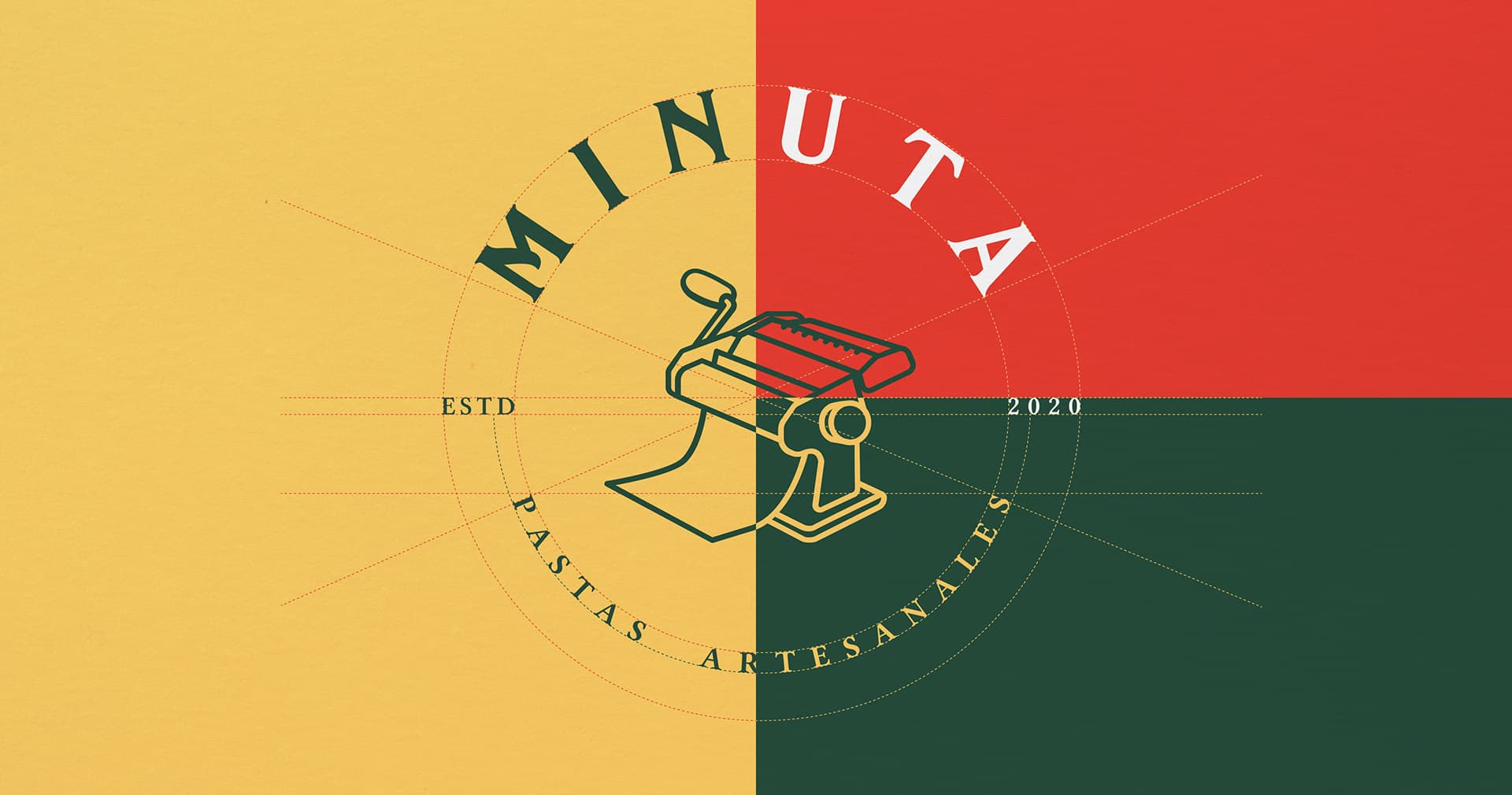
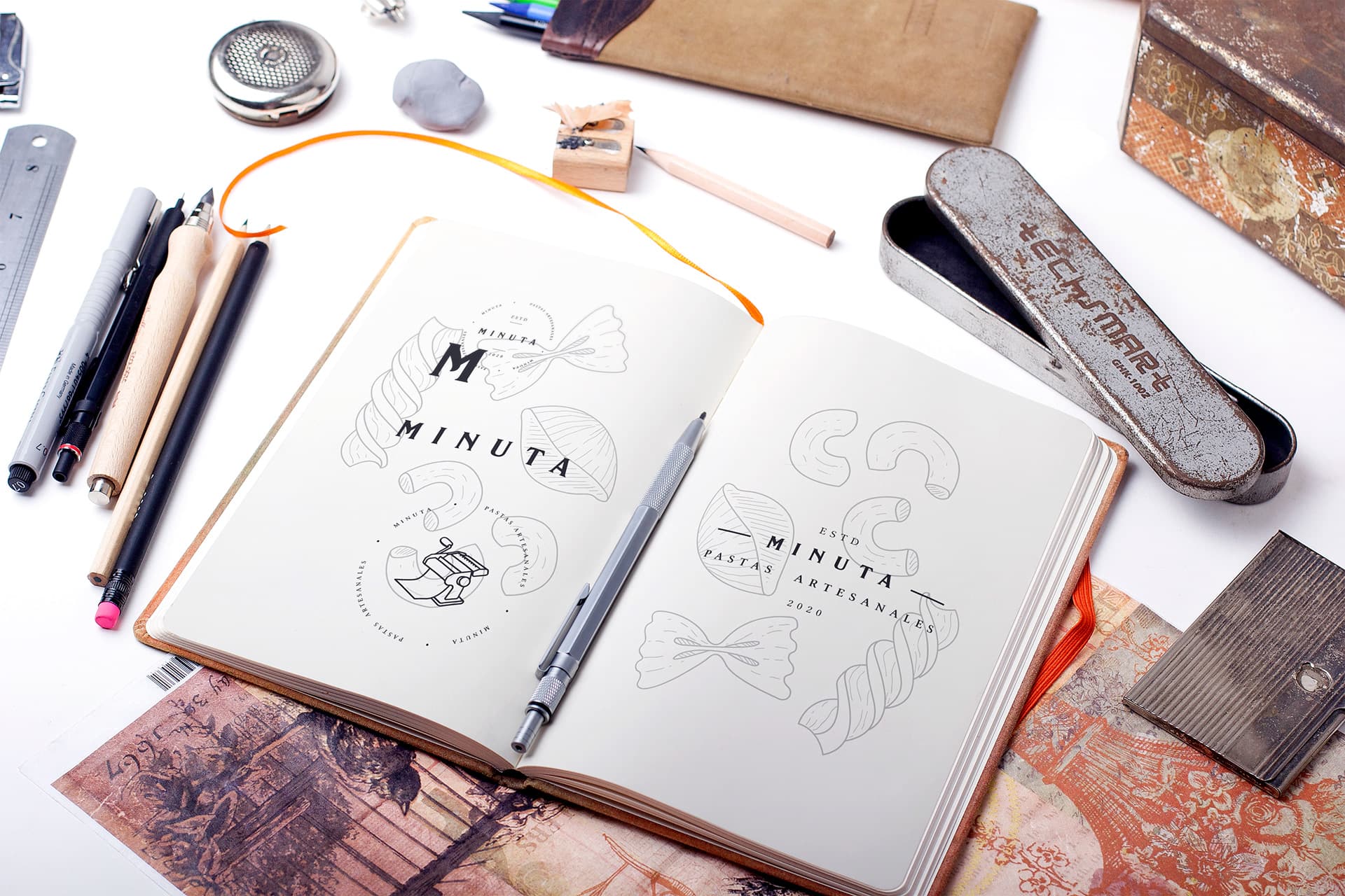
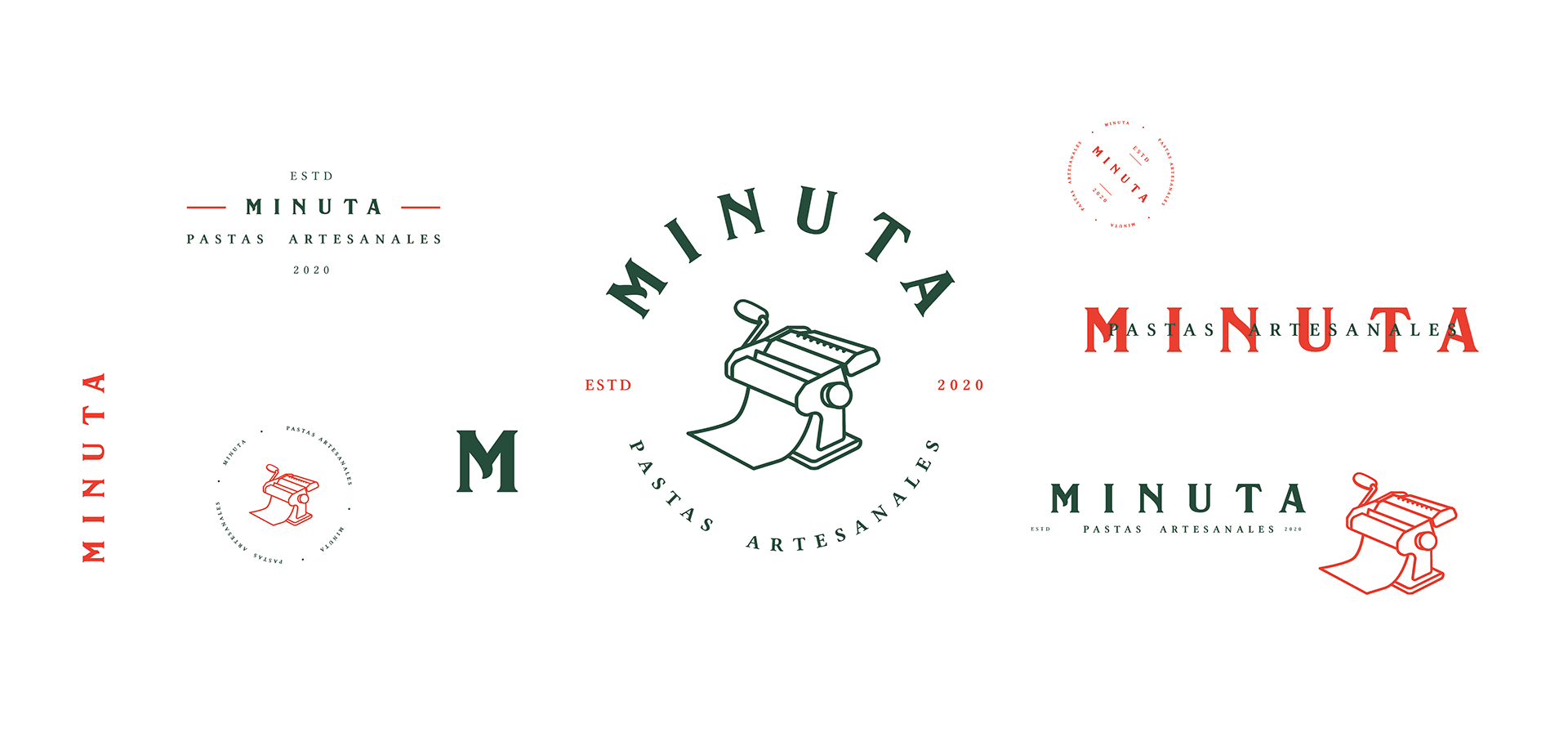
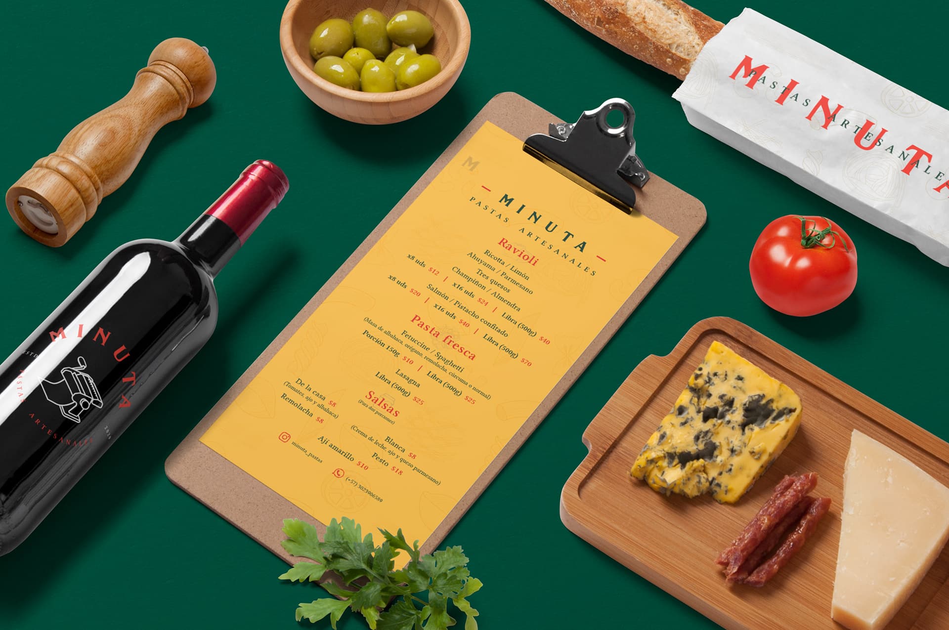
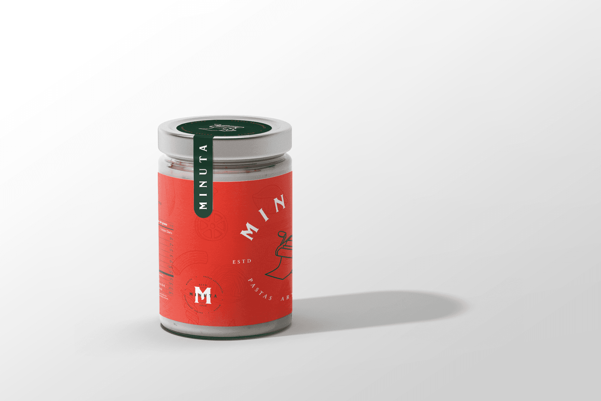
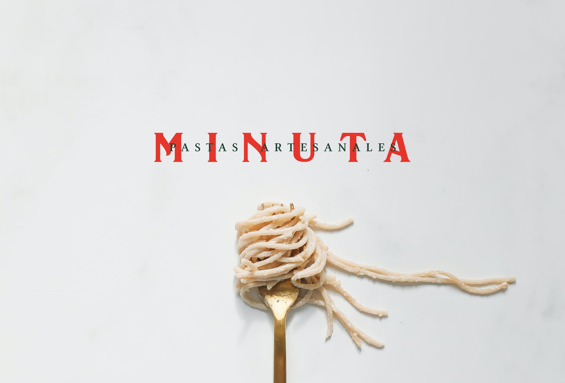
Camilo Gonzalez had spent years perfecting his pasta by hand — the texture of the dough, the weight of the cut, the filling done piece by piece. Minuta needed an identity that matched that level of care. Not a stylized restaurant brand. Something that felt discovered, not designed. The process started with the pasta machine itself. Centering the logo around the mechanism was an honest decision: it's the tool that defines the work, the one object that makes Minuta what it is. The wordmark wraps the illustration with quiet confidence — no flourish, just commitment. Colour did the rest of the storytelling. Terracotta red, herbed green, warm yellow — the palette reads as a dish before it reads as a brand. It evokes the ingredients without naming them. From identity to packaging, menus, and social assets, every element was built from the same system — designed to travel from a market stall to a dinner table without losing coherence or warmth.
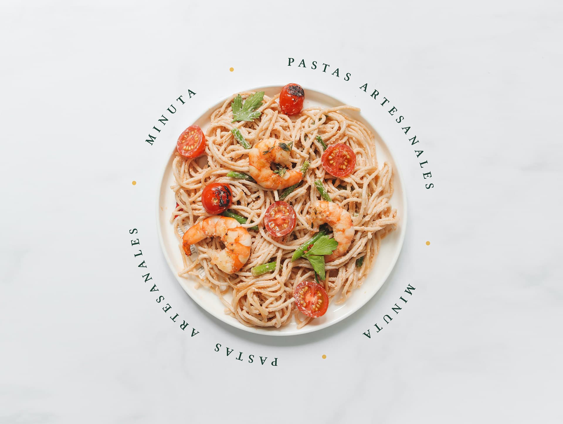
Minuta Artisan Pasta gallery image 1
Minuta Artisan Pasta gallery image 2
Minuta Artisan Pasta gallery image 3
Minuta Artisan Pasta gallery image 4
Minuta Artisan Pasta gallery image 5
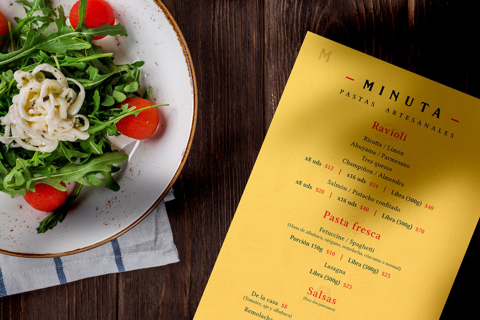
An identity has to work everywhere the business does — not just on screen, not just at the stall. For Minuta, that meant building a system that held from a Saturday market to a dinner table: sauce packaging, menus, business cards, and social assets all drawn from the same visual language. The packaging is where the system earned its keep. Labels designed to look right at refrigerator temperature, on a shelf next to non-branded competition, in someone's Instagram photo. The colour palette does the work — terracotta, green, warm yellow signal origin and craft before anyone reads a word. Every piece was built to be reproduced locally, with standard materials. A good identity for a small business doesn't need a production house — it needs rules clear enough to follow and flexible enough to survive.

A system that travels

Minuta Artisan Pasta gallery image 6
Minuta Artisan Pasta gallery image 7
Minuta Artisan Pasta gallery image 8
Minuta Artisan Pasta gallery image 9
Minuta Artisan Pasta gallery image 10
Atalú
Next projectRebrandAtalú

Visual identity and packaging system for a sugar-free pastry brand — repositioning “healthy” away from clinical codes and toward craft, warmth and indulgence.

View All