Motrix
UX/UI design for a dual-sided mobile app streamlining automotive service — booking, vehicle history, and staff management built into a single coherent interface.
Services
- UI/UX Design
- App Design
- Graphic Design
Year2023
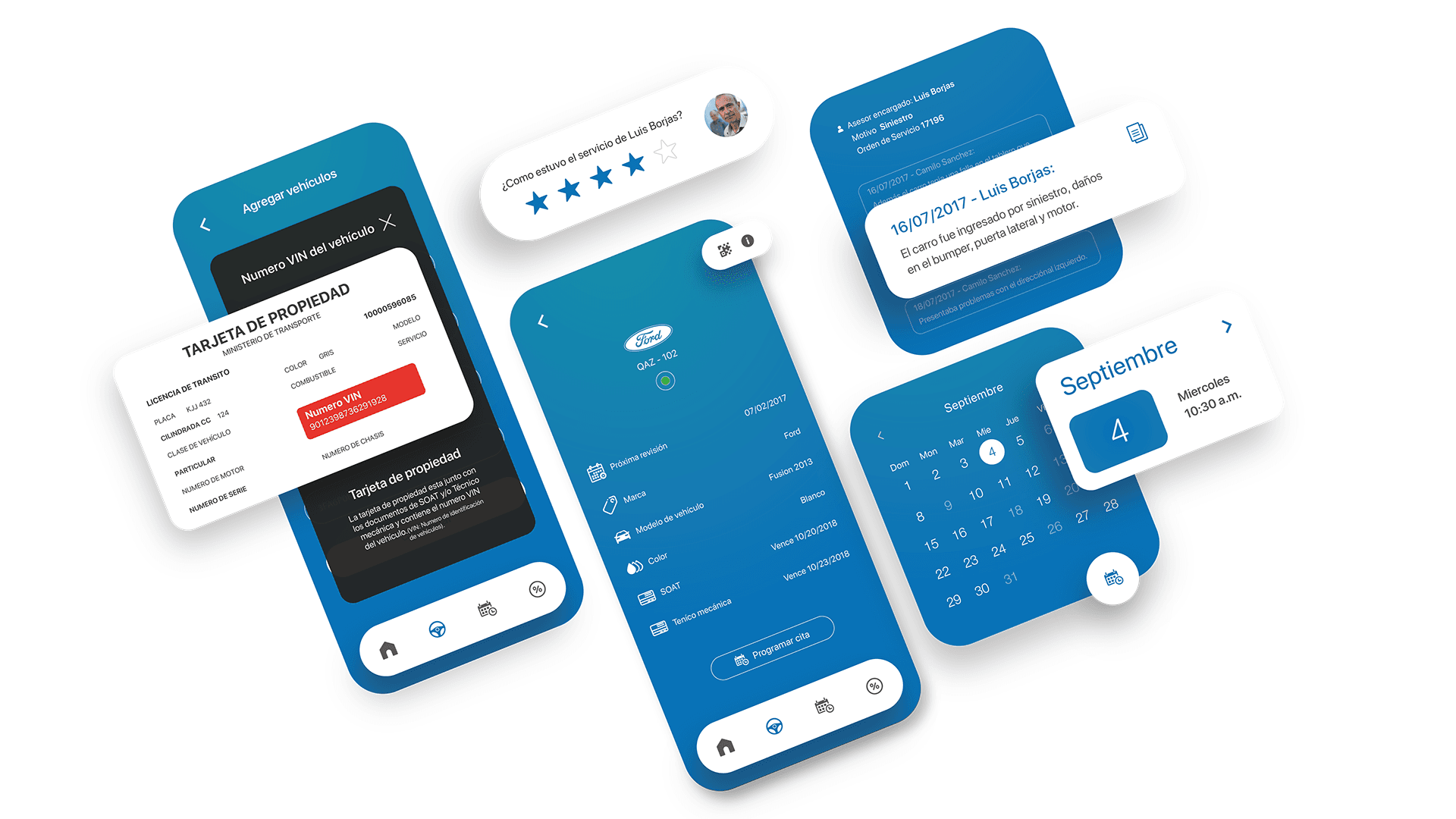
One interface, two user types, zero friction
Automotive service has a structural UX problem. The journey from booking to pickup involves phone calls, paper forms, and disjointed follow-ups — none of it designed to be experienced together. Motrix was the brief to fix that.
The core design challenge was dual-sided: the product needed to serve customers managing their own vehicles and dealership staff accessing records via QR code — without feeling like two different apps sewn together. The solution was a shared visual language built on a minimalist aesthetic, with role-based navigation that keeps each user in their context.
Trend research shaped the visual direction: the interface was designed to feel current and intentional, not generic. Clean hierarchy, deliberate typography, interaction patterns that reduce cognitive load at the point of use — whether a customer is booking an appointment or a service agent is pulling up a vehicle's history from the floor.
Deliverables spanned full mobile UI for iOS and Android, interactive prototypes, and wireframes for the staff dashboard used for data collection and user management. The result handles operational complexity beneath a surface that feels effortless.


The staff-facing side of Motrix had a different brief to the customer app. Dealership technicians don't use products the way product managers imagine — they use them while talking to someone, with grease on their hands, under fluorescent lighting at 7am.
The QR code flow for vehicle lookup was the centrepiece of the staff experience: scan a code on arrival, retrieve a full service history in under two taps. The interaction had to be frictionless under pressure — no search, no navigation, no margin for error when a customer is waiting.
The data collection dashboard extended this logic: structured inputs, minimal decisions, clear hierarchy. Every field placed because it needed to be there. The result is an interface built for the reality of a service lane, not the calm of a presentation.
Designing for the floor, not the demo


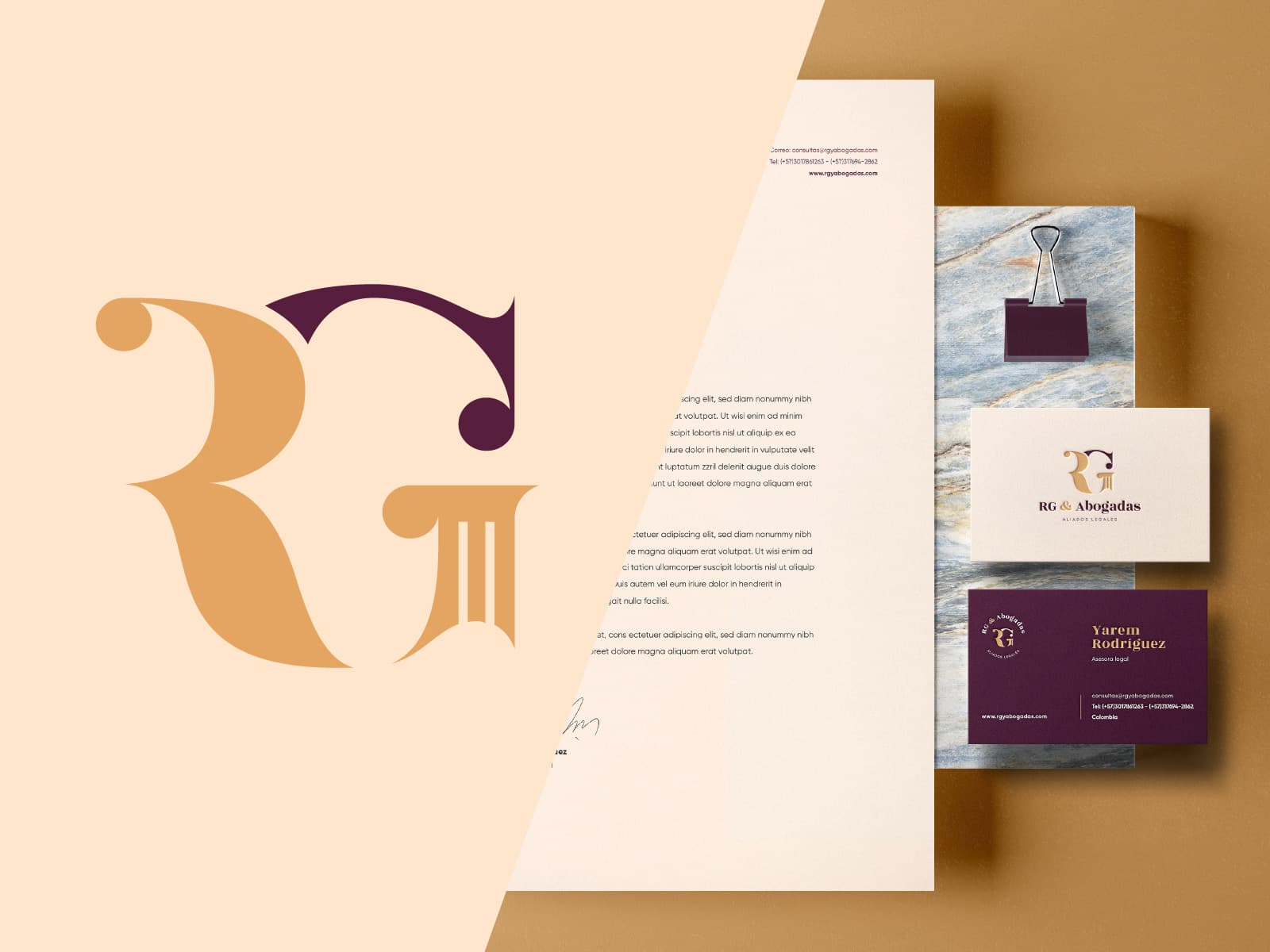
Next projectLegal ServicesRG & Abogadas - Visual Identity
Brand identity and website for a women-led legal consultancy — authority without the cold, interchangeable codes of the category.