Carbon Crusher
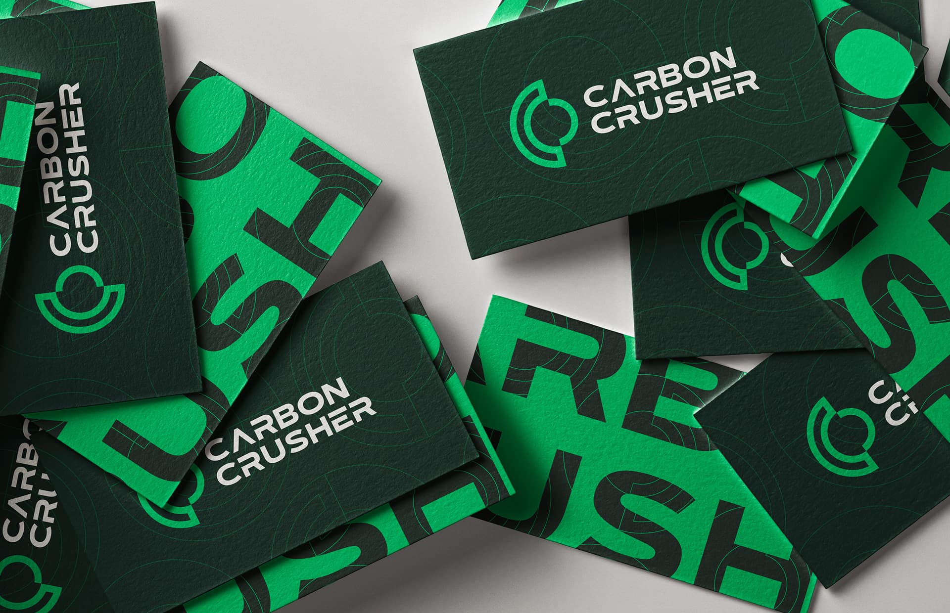
Brand identity for an environmental engineering company turning roads into a climate solution — designed at Superside.
- Logo Design
- Brand Identity
- Marketing Collateral
- Digital Assets
- Stationery
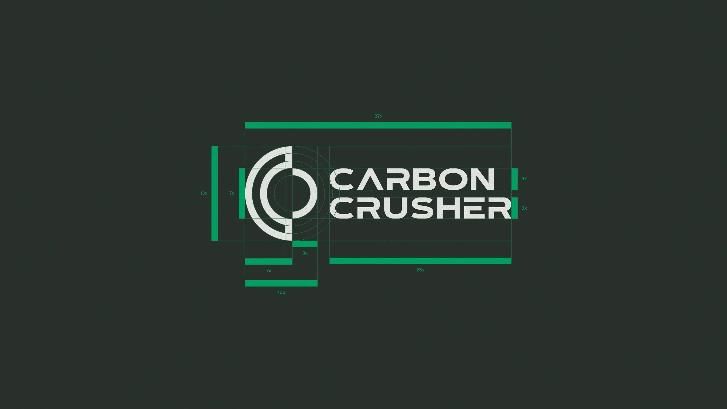
A mark that visualises a closed loop
Challenge
Carbon Crusher rebuilds roads into a carbon sink. The category had no visual language for that: environmental engineering either looks like a utility contractor or like a wellness brand, and neither reads as serious infrastructure with a climate thesis.
Approach
I designed the identity at Superside alongside the account art director, from logomark exploration through the applied system. The work was to find a mark with the weight of infrastructure and the intent of climate work, then extend it into a system of real applications.
Outcome
The mark went onto real workwear, including hard hats and hi-vis vests.


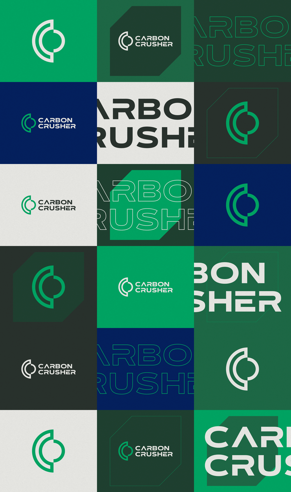
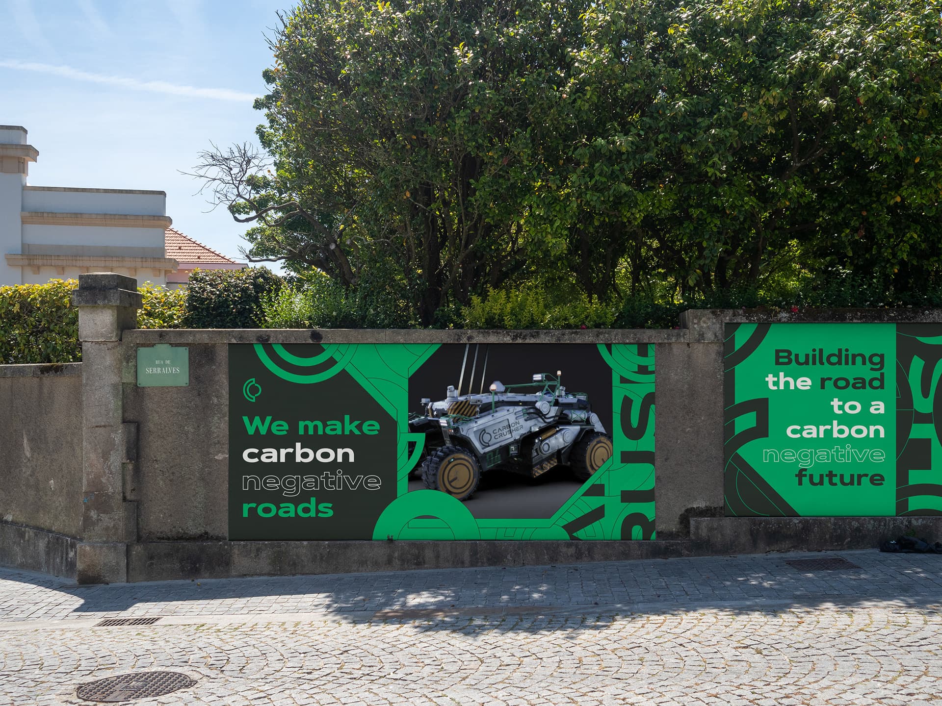
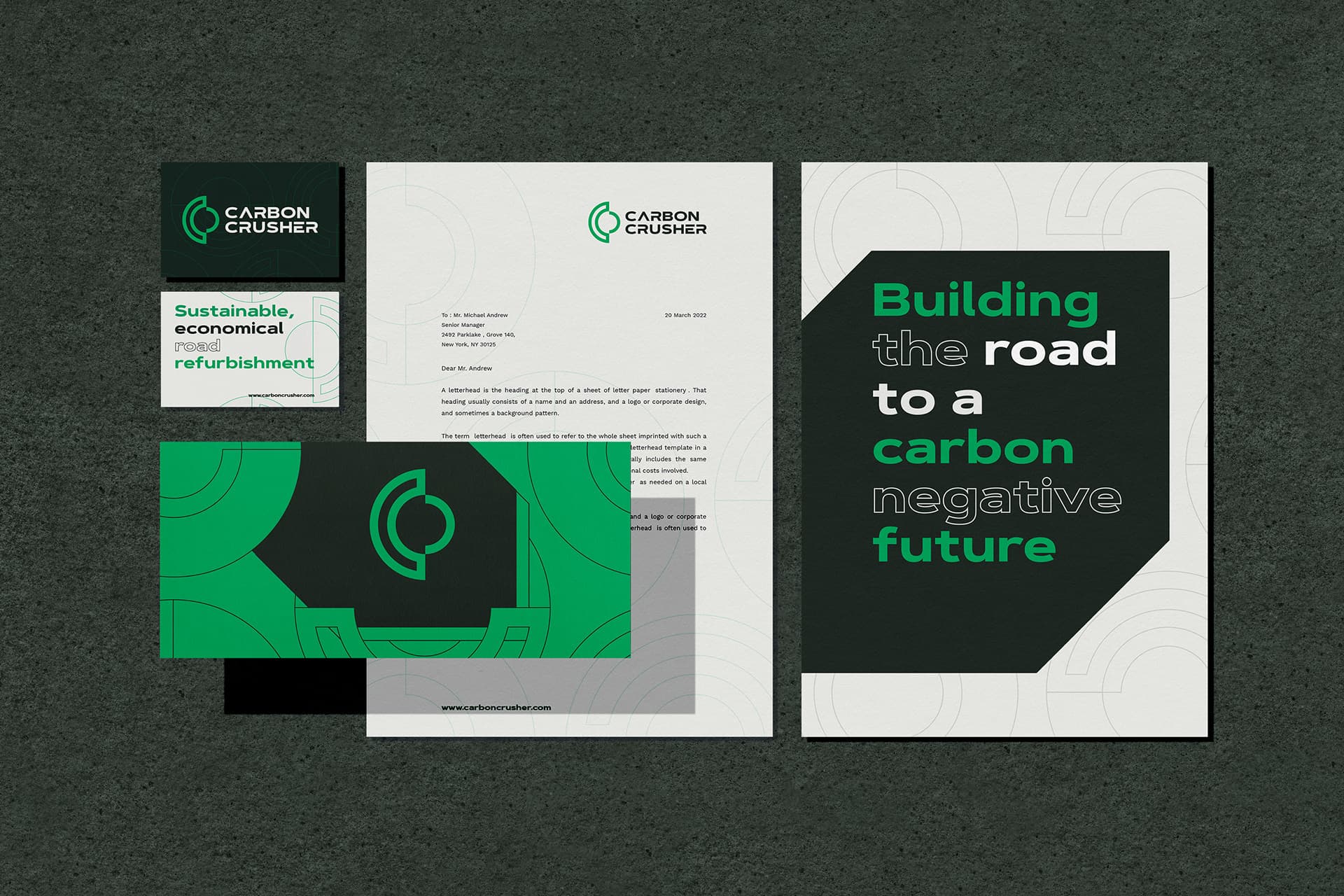
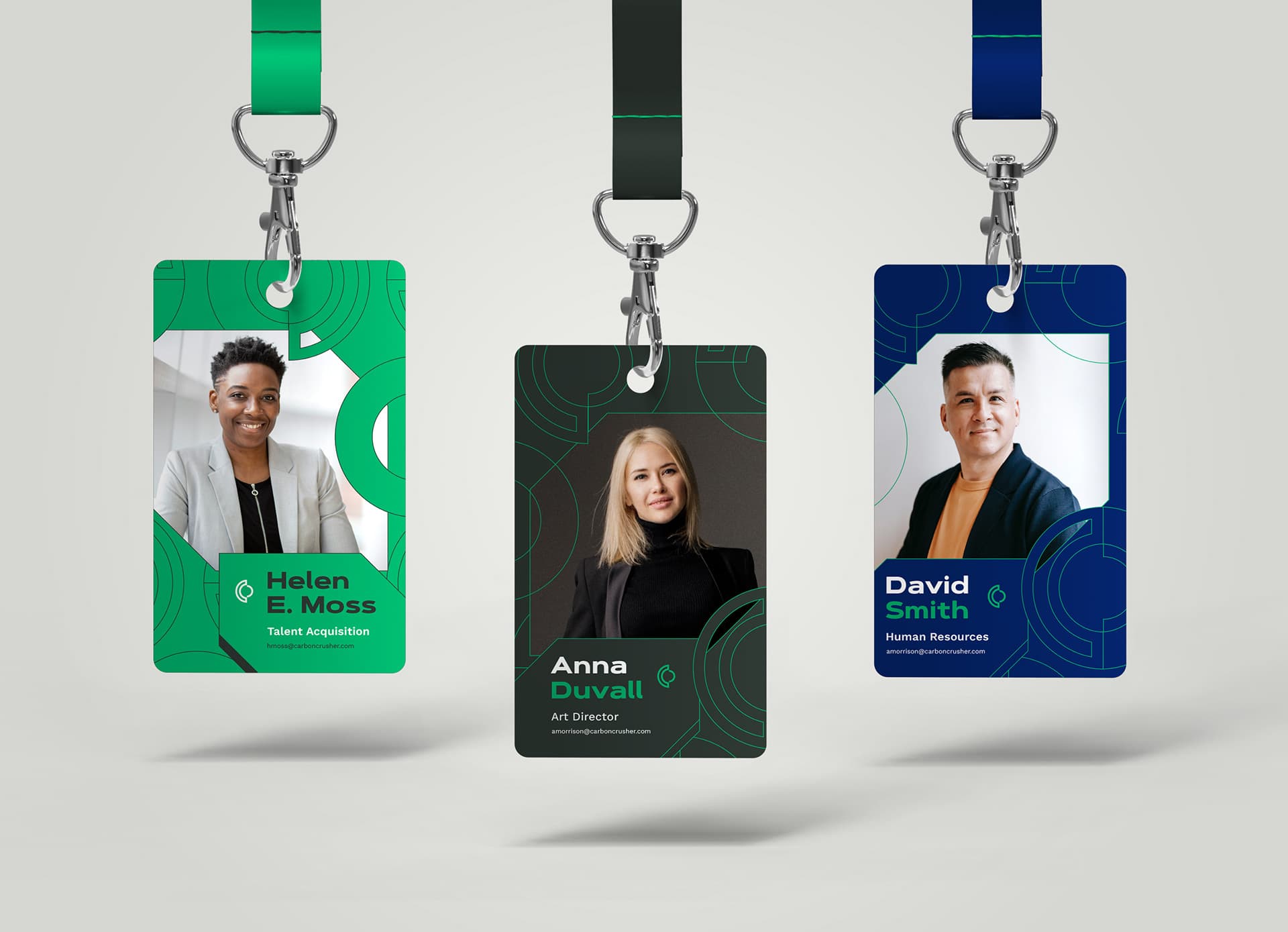
Identity at every scale


Visual identity and packaging system for a sugar-free pastry brand — repositioning “healthy” away from clinical codes and toward craft, warmth and indulgence.