R•A
WorkAboutFreelanceContact
Navigation
WorkAboutFreelanceContact
Social
InstagramLinkedInDribbbleBehance

© 2026 Ricardo Angulo.
All rights reserved.

RICARDO ANGULO
Rebrand

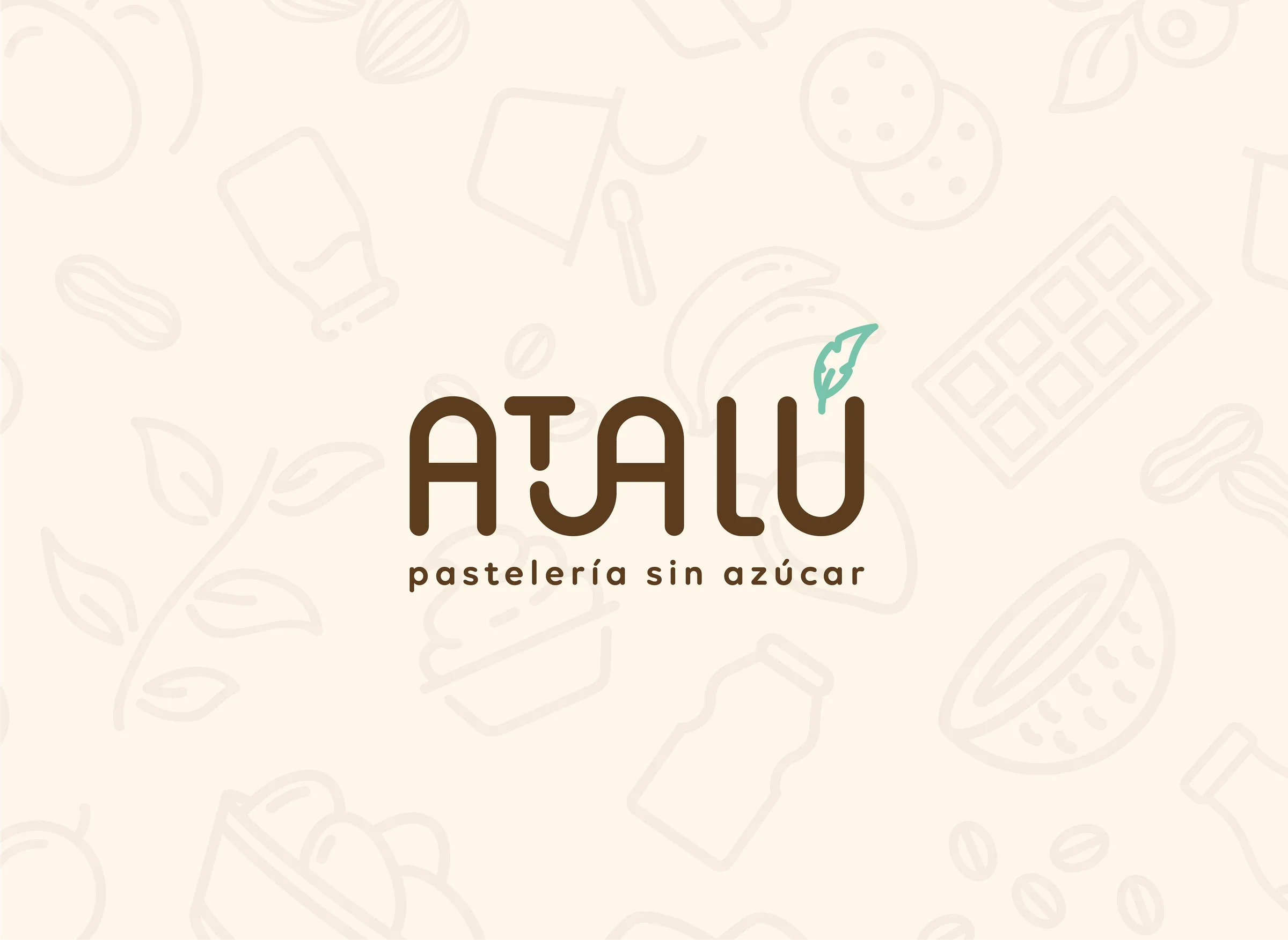
Atalú

Visual identity and packaging system for a sugar-free pastry brand — repositioning “healthy” away from clinical codes and toward craft, warmth and indulgence.

Services
  • Brand Identity Design
  • Logo Design
  • Packaging Design
  • Menu Design
  • Business Card Design
  • Social Media Assets
Year2023
Role

Brand Identity Design / Logo Design

Scope

Brand Identity Design, Logo Design, Packaging Design

Atalú
Project Impact

Challenge

Atalú needed a clearer rebrand direction that could turn the project idea into a more coherent and usable visual presence.

Direction

The work focused on brand identity design, logo design, packaging design, building a visual language that could stay consistent across the main touchpoints.

Outcome

The result gives Atalú a more defined creative direction and a stronger foundation for communication, rollout and future visual decisions.

Indulgence without the asterisk

Atalú's founders had spent years making pastries they actually believed in — sugar-free, carefully sourced, made from scratch. The problem wasn't the product. It was that 'sugar-free' had been coded by the market as clinical, austere, a compromise. The identity needed to break that association entirely. The brief was tonal before it was visual. The brand had to feel indulgent and warm — the kind of thing you'd slow down for in a bakery case — while still communicating a genuine commitment to better ingredients. Not a health brand wearing craft clothing. A craft brand that happens to be healthy. The solution was a palette that leans into richness: deep, saturated tones, artisan textures, typography that reads as handmade without tipping into precious. Every touchpoint was designed to work in print and at shelf — packaging, menus, and identity assets that stand out before a customer reads a single word. The result is a brand that earns trust through presence, not disclaimers.
Atalú gallery image 1
Atalú gallery image 2
Atalú gallery image 3
Atalú gallery image 4
Atalú gallery image 5
Atalú gallery image 6
A brand identity lives or dies at the point of purchase. For Atalú, that's a bakery case — a high-competition environment where most products are screaming for attention with the same visual language: clinical whites, green leaf icons, the visual shorthand of 'healthy'. The brief was to refuse all of that. The packaging system was designed to hold its ground in that context through warmth and material quality rather than contrast. Labels, boxes, and bags built from the same palette — each one recognisable as Atalú before a customer reads the name. Menu design and social assets completed the system, ensuring the same feeling carried from an in-store experience to a digital one. The touchpoints aren't separate decisions — they're the same decision, repeated across every surface the brand occupies.

Every touchpoint earns its place

Atalú gallery image 7
Atalú gallery image 8
Atalú gallery image 9
Atalú gallery image 10
Atalú gallery image 11
Atalú gallery image 12
Atalú gallery image 13
Atalú gallery image 14
Atalú gallery image 15
Atalú gallery image 16
Atalú gallery image 17
Atalú gallery image 18
Atalú gallery image 19
Atalú gallery image 20
Atalú gallery image 21
Atalú gallery image 22
Carbon Crusher
Next projectRebrandCarbon Crusher

Brand identity development for an environmental engineering company turning road infrastructure into a climate solution — developed at Superside in collaboration with the art director.

View All