ATAVUS Priorat
Brand strategy and visual identity for a regenerative winery in Priorat — translating land, lineage and low-intervention winemaking into a contemporary system.
Services
- Brand Strategy
- Art Direction
- Visual Identity
- Packaging Direction
- Editorial Design
Year2023–2024
LocationGratallops, Tarragona, Spain
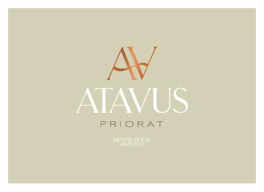
A wine identity rooted in the land
ATAVUS is a winery rooted in Gratallops, in the heart of Priorat. Its story connects family lineage, regenerative viticulture and a close relationship with the landscape. The brand needed to express that depth without falling into the familiar visual codes of traditional wine.
I developed the strategic and visual identity around traces of place: topography, cartographic detail, fingerprints and the layered texture of the vineyard. The AV monogram gives the system a precise anchor, while the earthy palette, field imagery and illustration language let it move between heritage and contemporary culture.
The result is a flexible foundation for the winery and its portfolio, spanning the brand book, packaging direction, technical wine sheets, photography and communication tools. Each touchpoint carries the same idea: wine as an expression of land, time and human craft.


Next projectBrand Identity / HospitalityMasti
A bold visual system for an Indian restaurant in Barcelona — bringing appetite, rhythm and colour across the street, screen and table.