NeuroFit Calisthenics
Identity and visual direction for a calisthenics school, pairing disciplined training imagery with a direct, high-energy brand language.
Services
- Brand Identity
- Art Direction
- Photography Direction
- Social Design
Year2020
LocationBarranquilla, Colombia
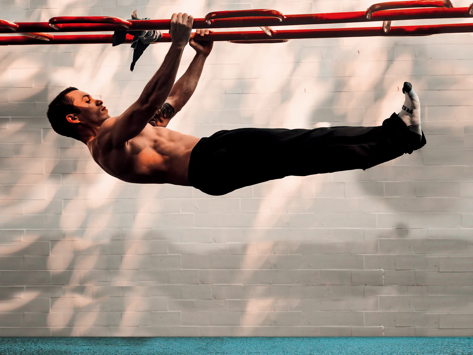
Discipline and movement without fitness cliches
NeuroFit is a calisthenics school built around body control, progression and disciplined training. Its identity needed to feel energetic and contemporary without blending into the visual language of conventional gyms.
I developed the brand direction around high-contrast black, white and red, condensed typography and movement-led photography. The visual system creates a sense of focus and effort, while the identity presentation connects the name to education, exercise and personal development.
The result is a direct visual language for a training community: recognisable in a portrait, a social post or a compact brand mark, and flexible enough to support both motivation and instruction.



Next projectContent Design / Brand StewardshipAepiphanni
Content design system for a business consultancy, bringing one visual rhythm to social media, newsletters and podcast communication.